AN SUPPS
Chiquita Collab
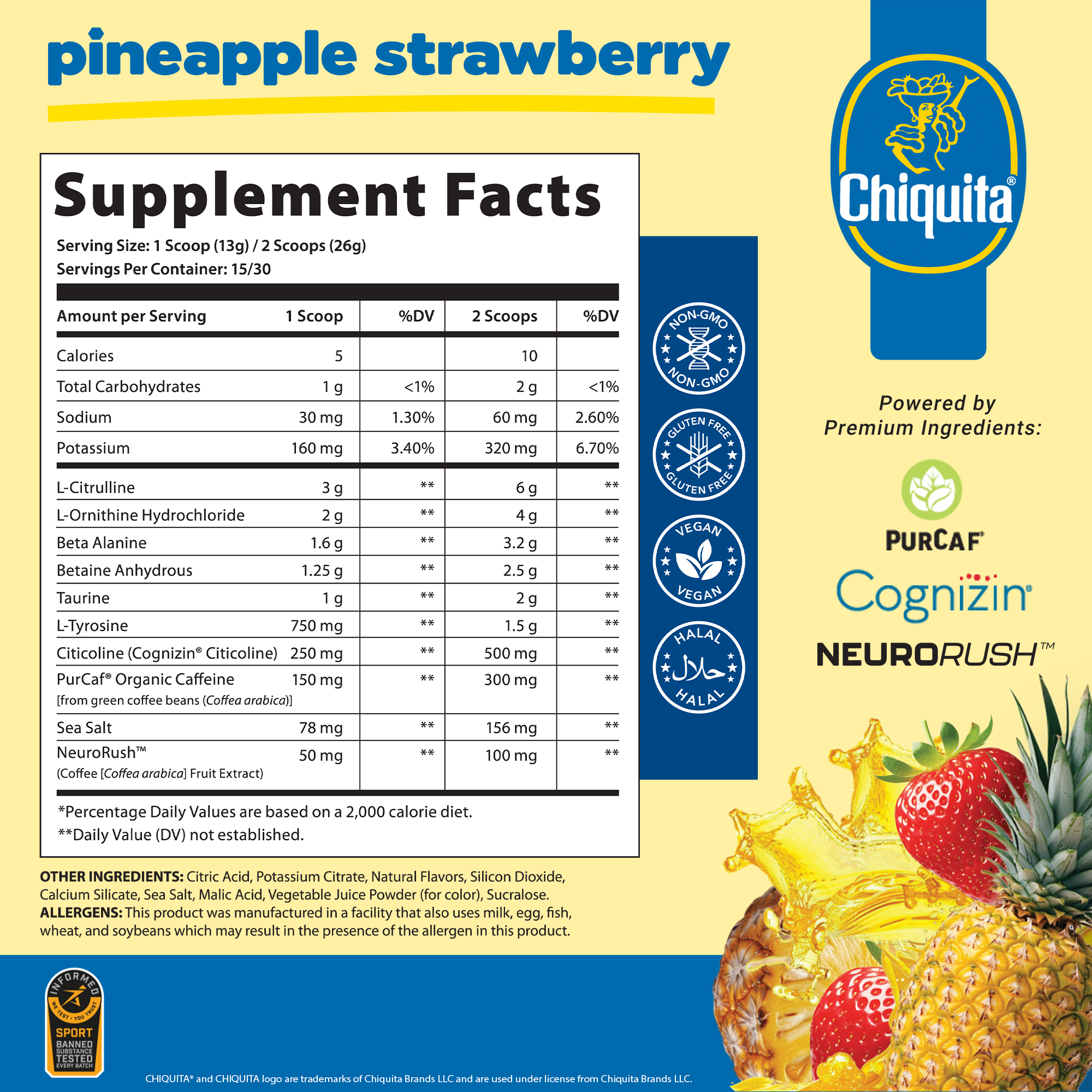
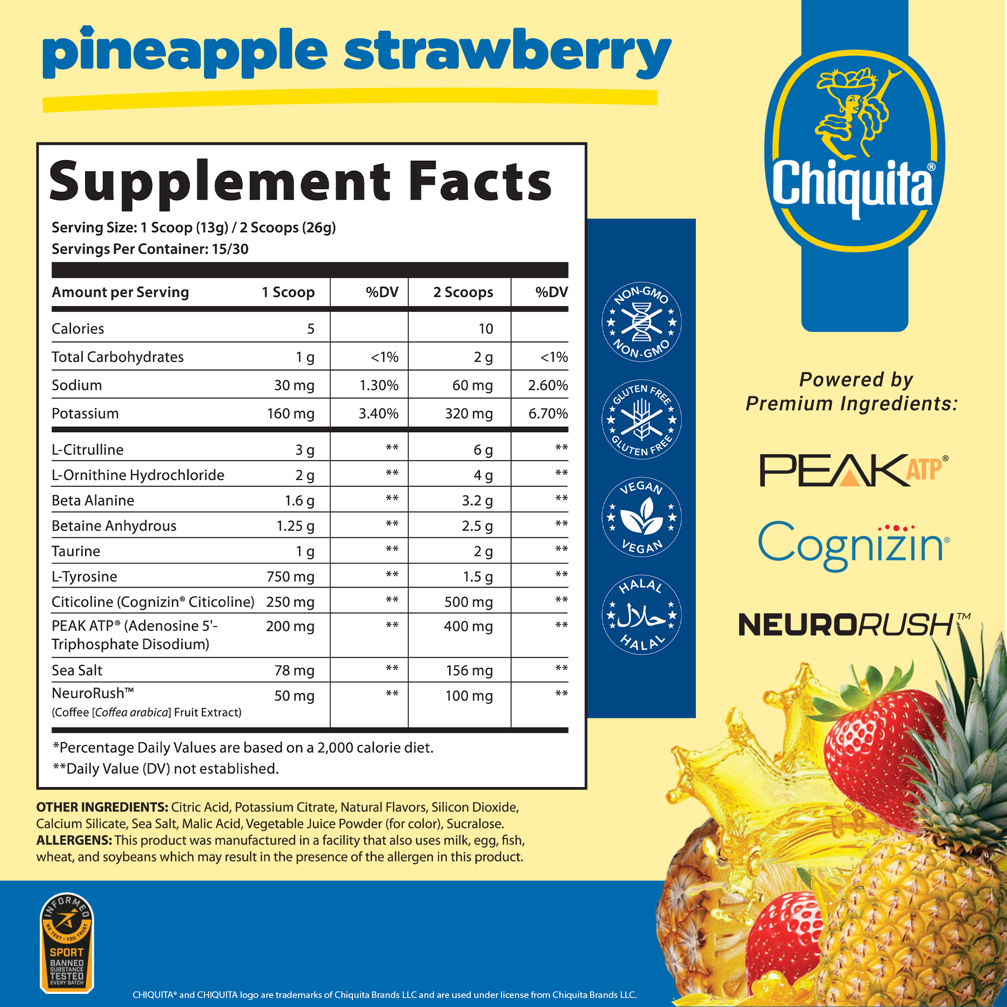
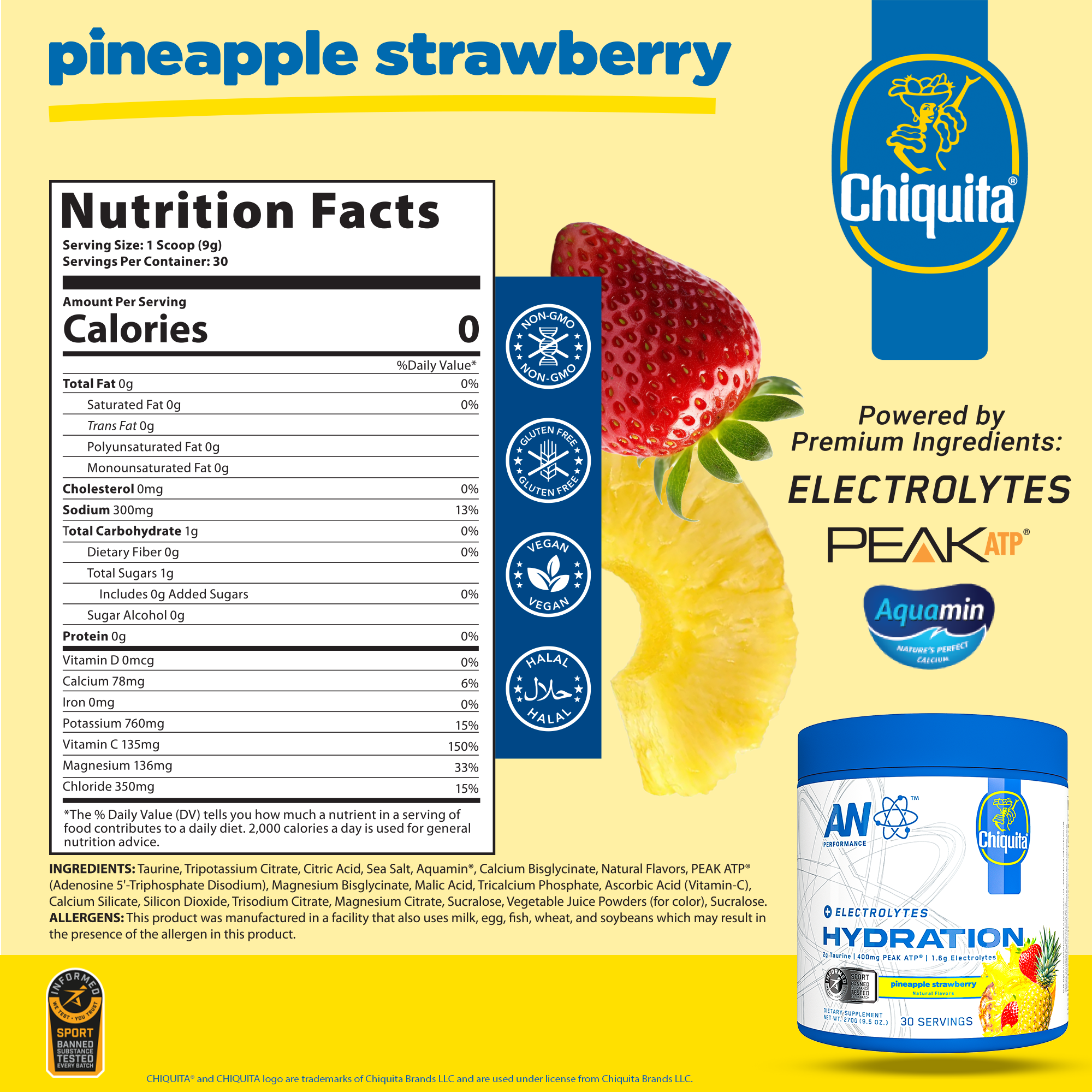
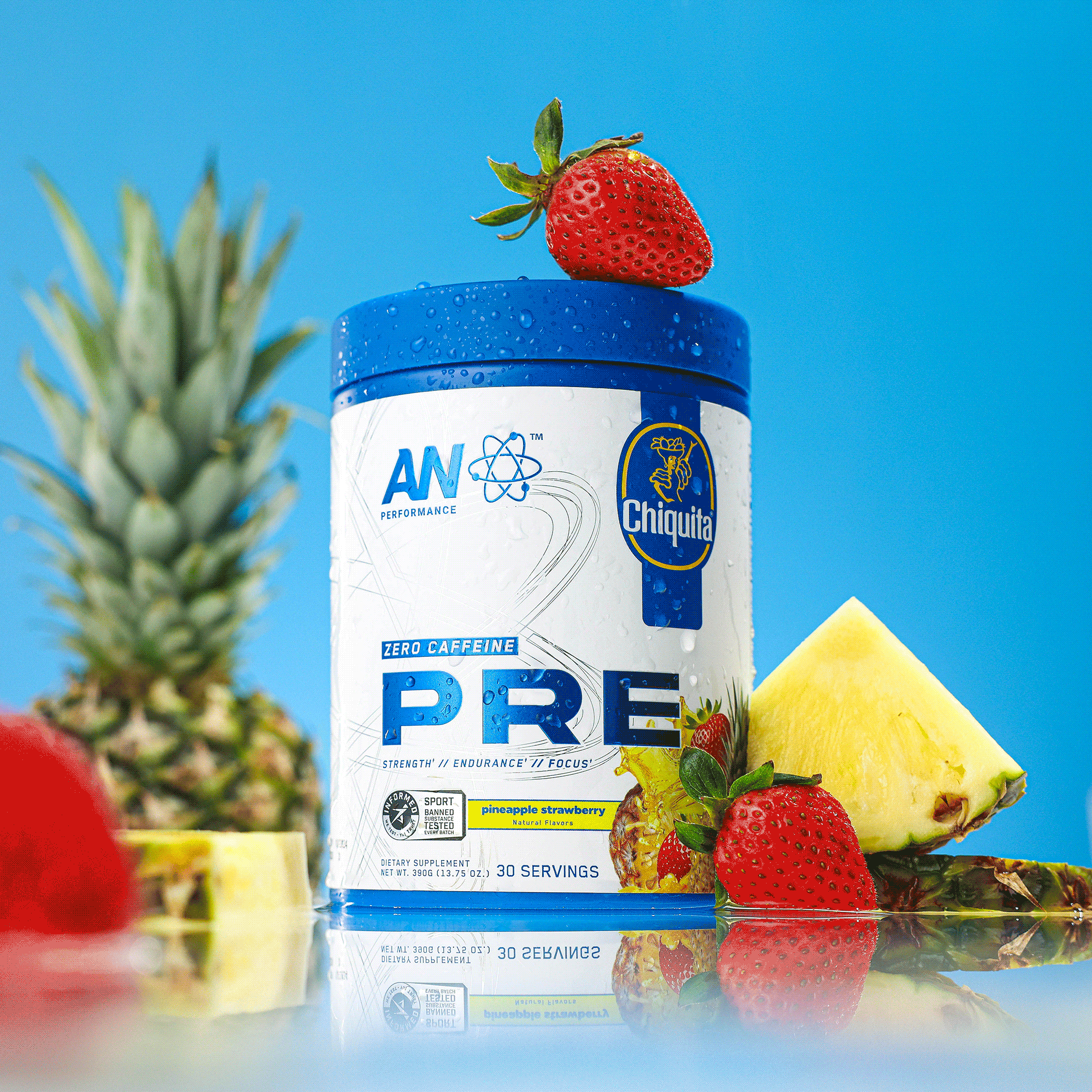
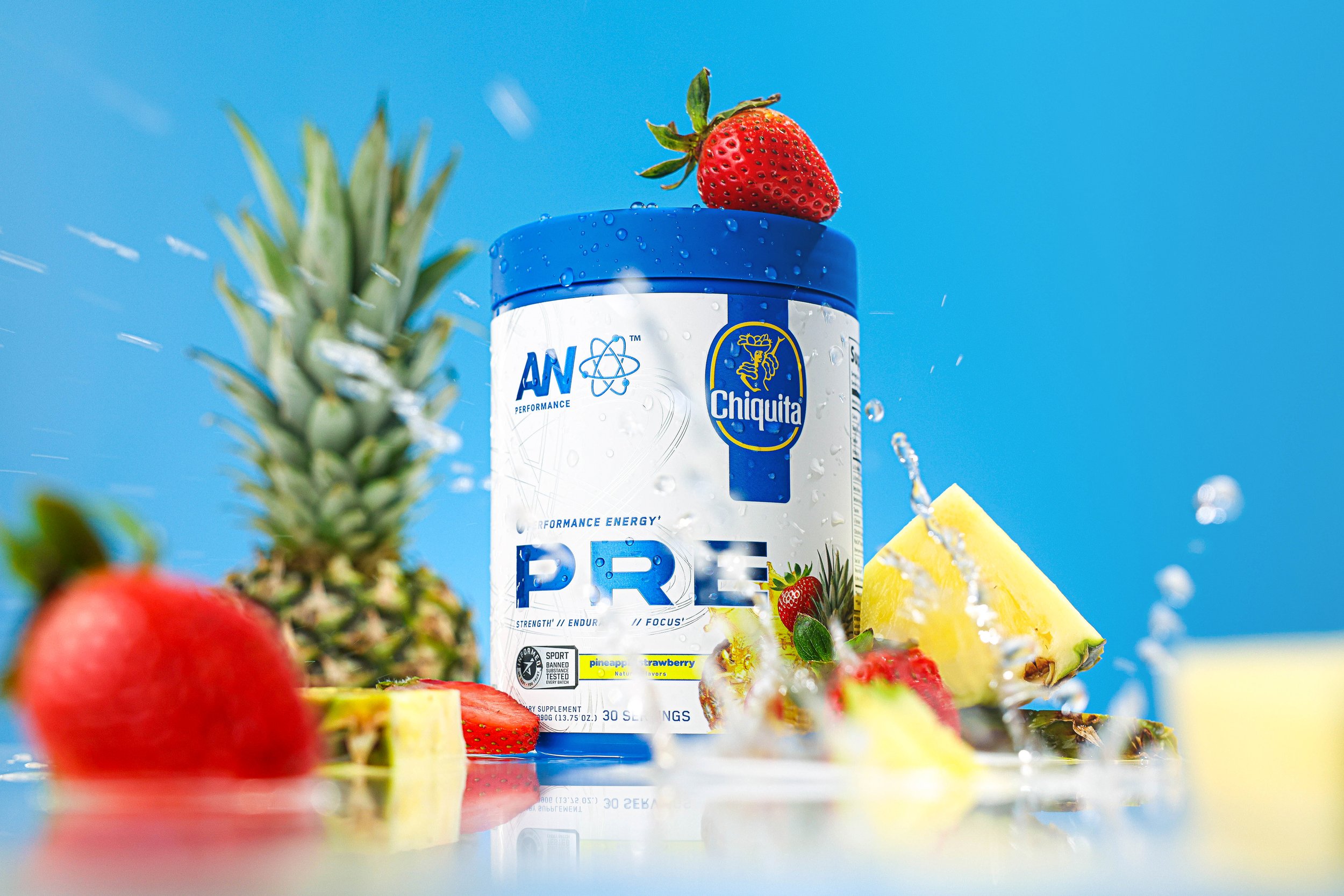
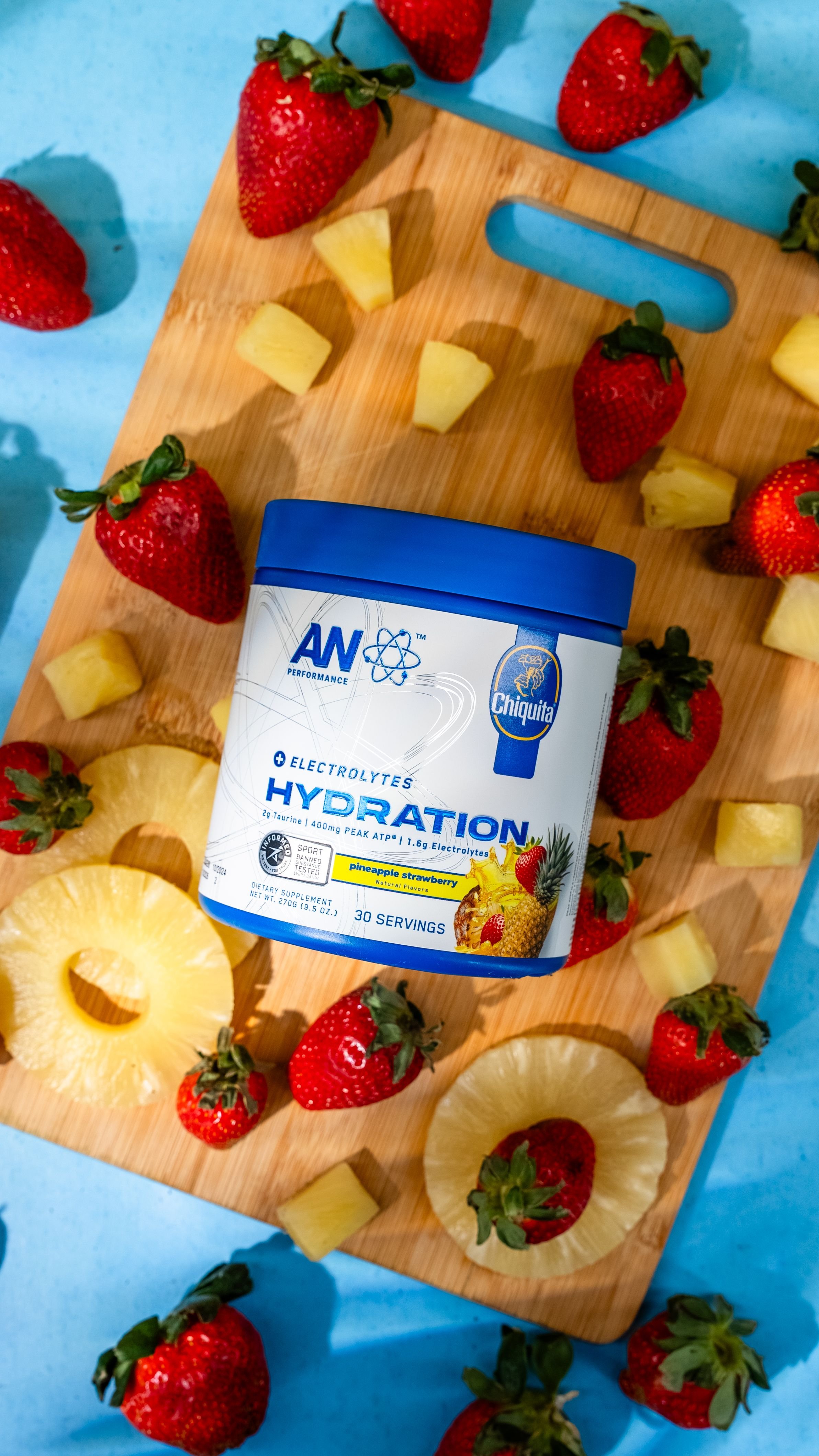
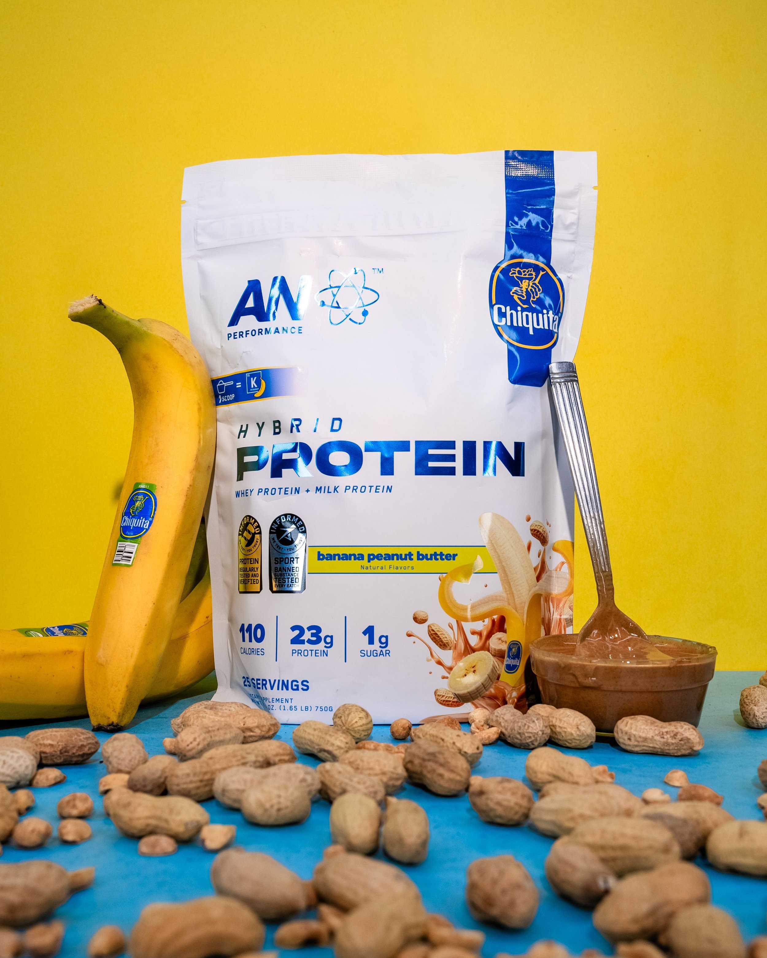
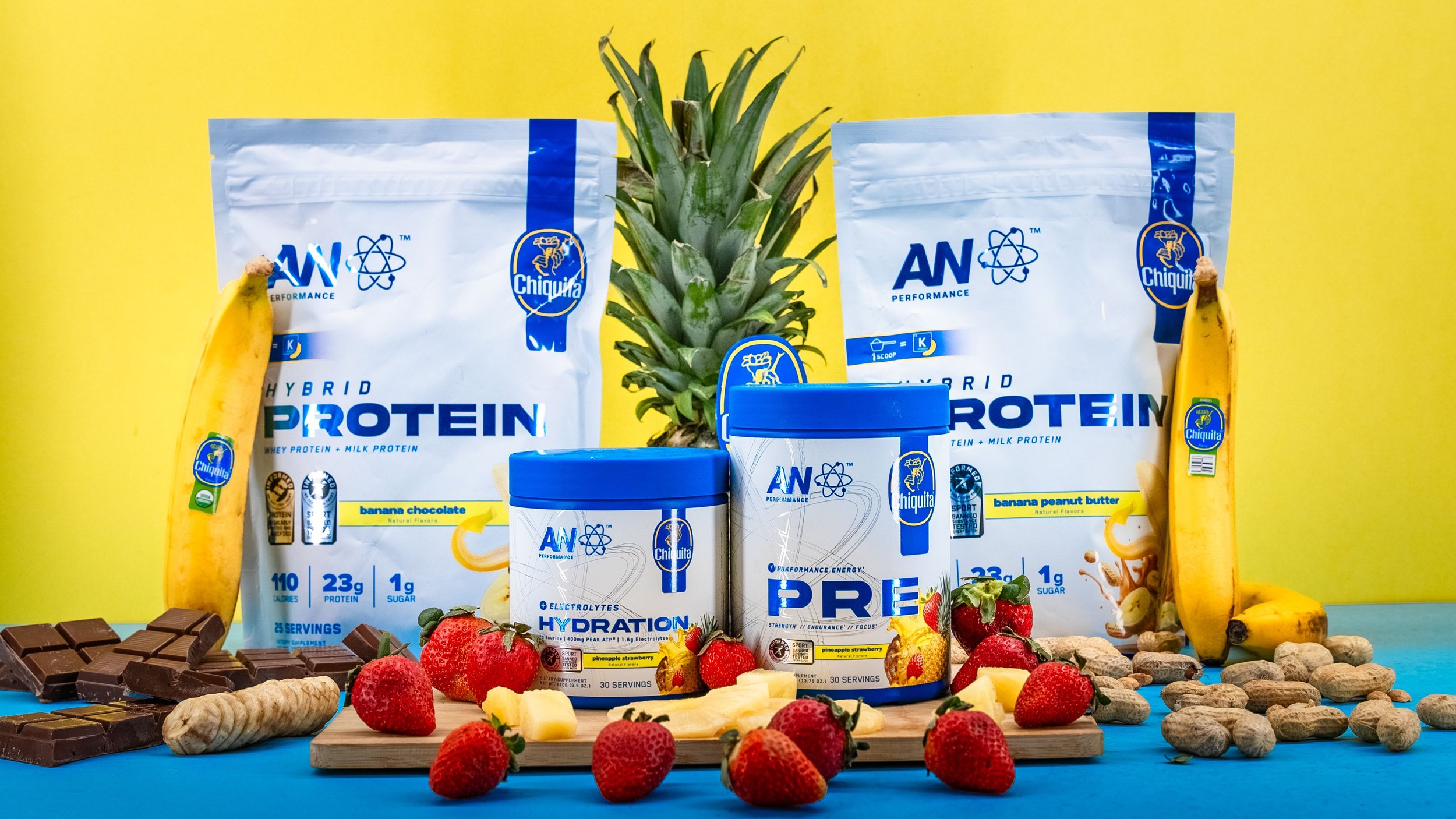
For our latest campaign, I spearheaded the creative direction for a line of pre-workout, non-caffeinated pre-workout, hydration powder, and protein powders flavored by Chiquita Brands LLC. This project required a deep understanding of Chiquita’s iconic brand identity, and I ensured that every label design aligned seamlessly with their established guidelines. Through extensive research, I developed a visually compelling aesthetic that complemented Chiquita’s vibrant, tropical essence while maintaining a strong presence in the fitness and nutrition space.
The label design process underwent meticulous review, involving both Chiquita executives and our in-house creative team, led by Bryant. Every detail—from typography and color palettes to imagery and brand messaging—was carefully refined to uphold Chiquita’s legacy while delivering a fresh and modern appeal to our audience.
Beyond the product labels, I directed a transformation of our digital presence, revamping our website’s product detail pages (PDPs) to reflect the Chiquita branding. This included immersive visuals, engaging content, and a cohesive design language that tied the entire campaign together. The result was a striking and recognizable brand experience that resonated with both Chiquita loyalists and new customers alike.
This campaign not only showcased my ability to execute high-level brand collaborations but also reinforced the power of strategic design in bridging fitness and lifestyle branding with a household name like Chiquita.
Scope of Work
Branding
Package Design
Marketing
Social Content
Printed Media
2025


Email signature
Email signature for internal members to support the launch of our Chiquita partnership. Made with Blender (3D), Adobe Photoshop, and Adobe Illustrator.
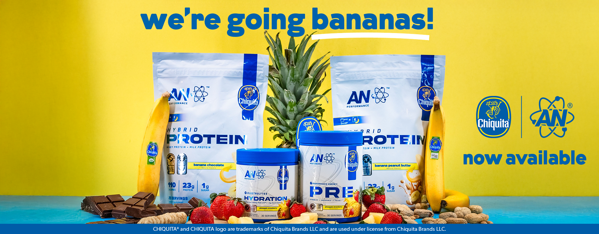
HOMEPAGE BANNER
Desktop

Mobile
WEBSITE ASSETS
I created personalized product description pages (PDP) for our website to support the launch of our Chiquita x AN collaboration. These PDP’s were created with the implementation of Chiquita’s use of typography, color palette, imagery, logo placement, and common branded catch phrases. This helped our brand stay aligned to the legacy of the Chiquita brand and successfully showcased the possibilities of a sports nutrition brand licensing a “better for you” flavor profile. Desktop and mobile versions were created for both site experiences.
Created using Blender (3D), Adobe Photoshop, and Adobe Illustrator.


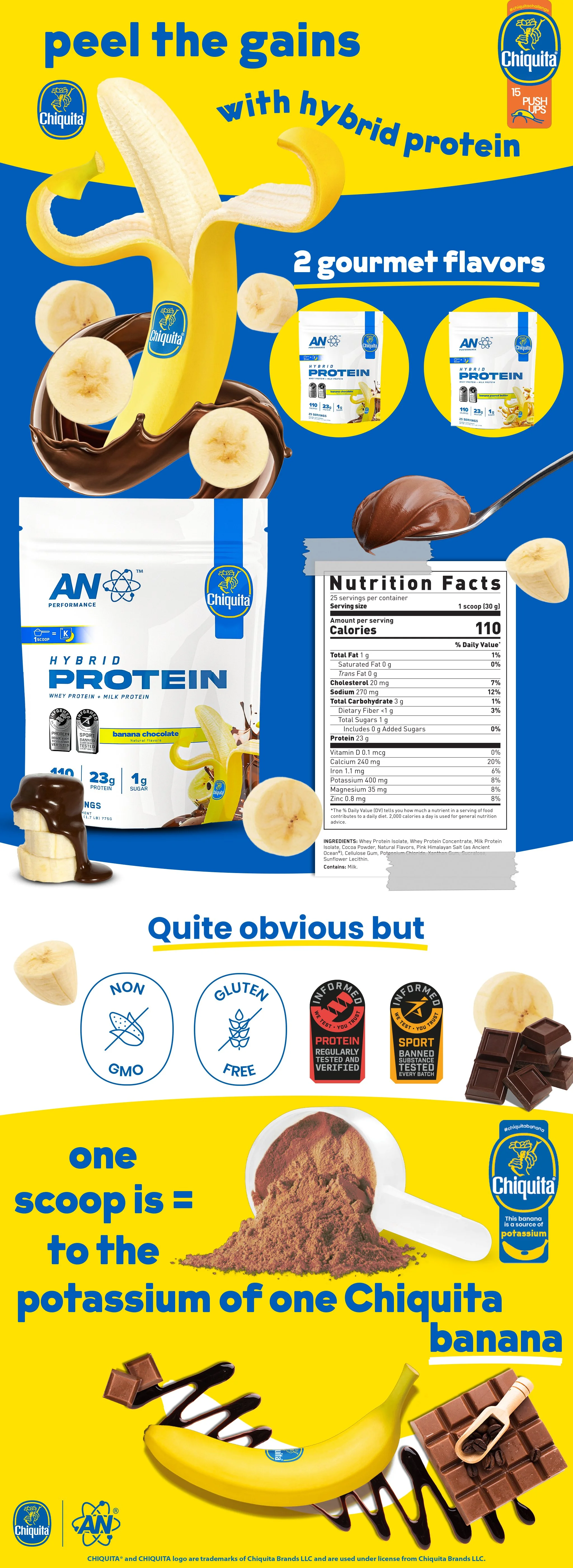

SITE IMAGES